LAUNCH
INTRODUCTION
It all began in 2020, when three founders joined forces out of a shared love for gaming and game creation. We believed we had something unique to offer to the world, and we set out to bring that vision to life. This marked our third attempt, one grounded in the lessons we’d learned and the passion we carried forward.
The number three became our inspiration—our team, our journey, and our ambition. That’s why we’re Round 3—and we’re all in.
BRANDING
At Round 3 Studios, we believe our brand identity should reflect the same excellence and passion that go into our games. That’s why we’ve created this brand standard.
Our approach to design is intentional and understated, allowing our games to take the spotlight. Within these Brand Guidelines, you’ll discover the key elements—written, visual, and graphic—that define who we are. The following pages provide direction on how to use them consistently, ensuring everything we create feels uniquely Round 3 Studios.
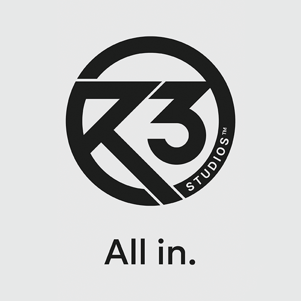
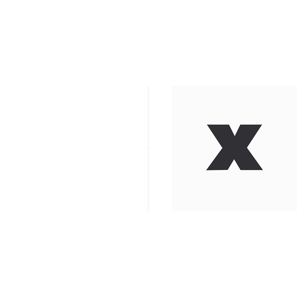
THE LOGO
The Round 3 Studios logo is a core element of our brand identity, embodying our values, vision, and unique journey. It consists of a circular design made of three distinct segments, symbolizing our name, our team of three founders, and the stability of a three-legged foundation. The sharp, clean edges reflect agility and precision, key attributes of our work and approach.
To maintain the integrity and impact of our logo, it is essential to use it consistently and respectfully across all platforms.
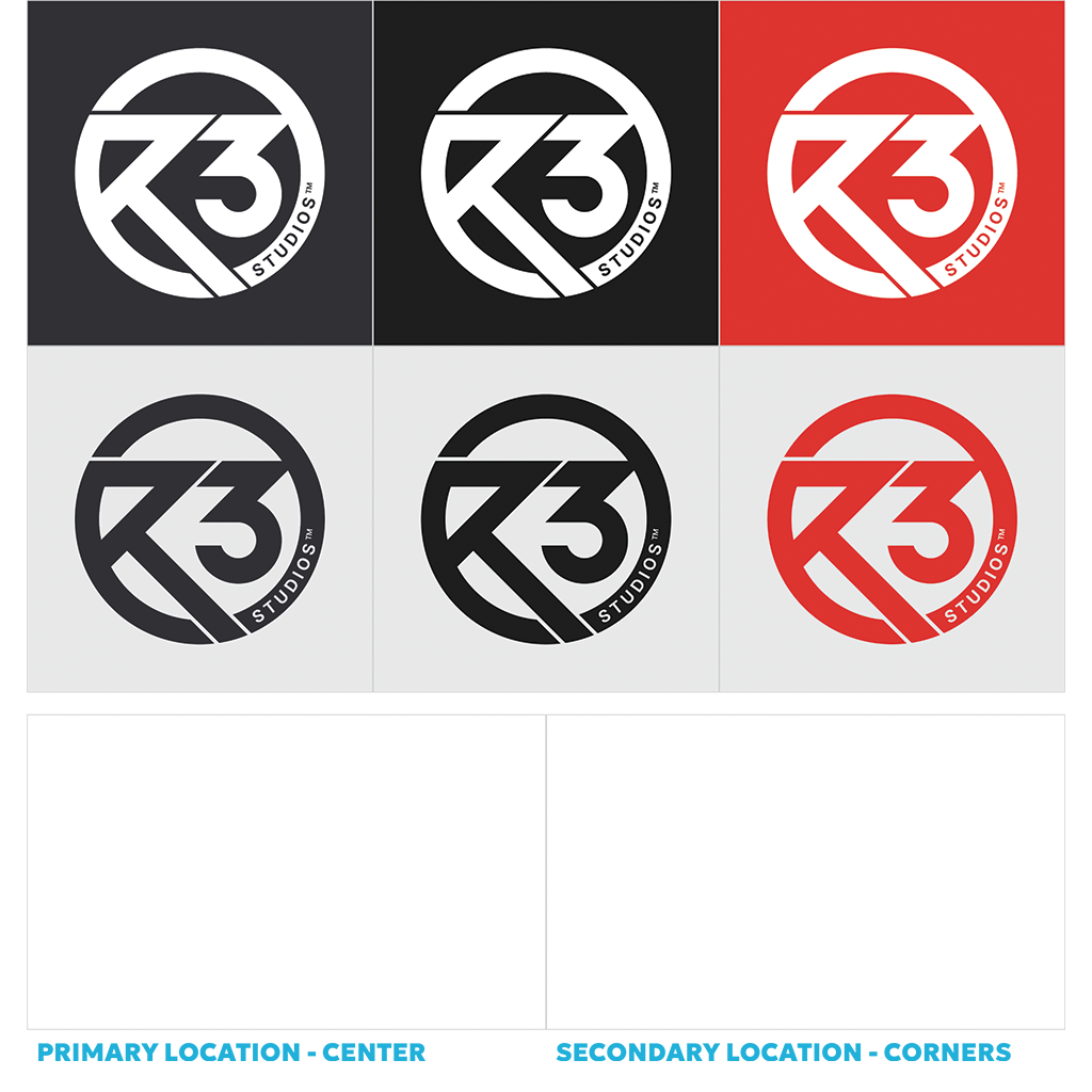
USAGE GUIDELINES
- Use the logo only in its primary versions—primary colors.
- A dark background is preferred for optimal visibility, but a white background is also acceptable. On colored backgrounds, the white logo version is recommended.
- Ensure the logo has ample clear space around it, free from any text or other design elements.
- The logo must not be stretched, skewed, or modified in any way. It should always be displayed in its original aspect ratio.
- Avoid placing the logo over busy images or patterns that may compromise its clarity.

CLEAR SPACE
Our logo needs space to breathe to stay clear and impactful. Always ensure it’s surrounded by enough room, free from any distractions. The clear space is measured by the width x 2 of the out circle.

USAGE AND LOCATIONS
Preferred logo usage examples and locations are here. Of course, we wouldn't say no to more aesthetic views :)
PLACEMENT
When combining the R3 logo with other logos, it’s important to make sure there is enough spacing provided between the logos. The logos should be separated by a 1px white stroke.
PRIMARY TYPEFACE
Our typeface is Geologica, a versatile font that balances geometric precision with a human touch, complementing our brand’s clean aesthetic.
Headlines are always uppercase, with supporting text sized at X / 1.68 of the headline. Text should remain clear and readable while reflecting our modern identity.
USAGE GUIDELINES
- Headlines: Bold and impactful, Geologica is used for headlines, signage, and any attention-grabbing text.
- Body Text: Optimized for readability, Geologica is perfect for subheads and body copy, ensuring clarity across all mediums.
FALLBACK FONTS
- Whenever it’s not possible to use our font families, the following alternative option should be used.
- Roboto

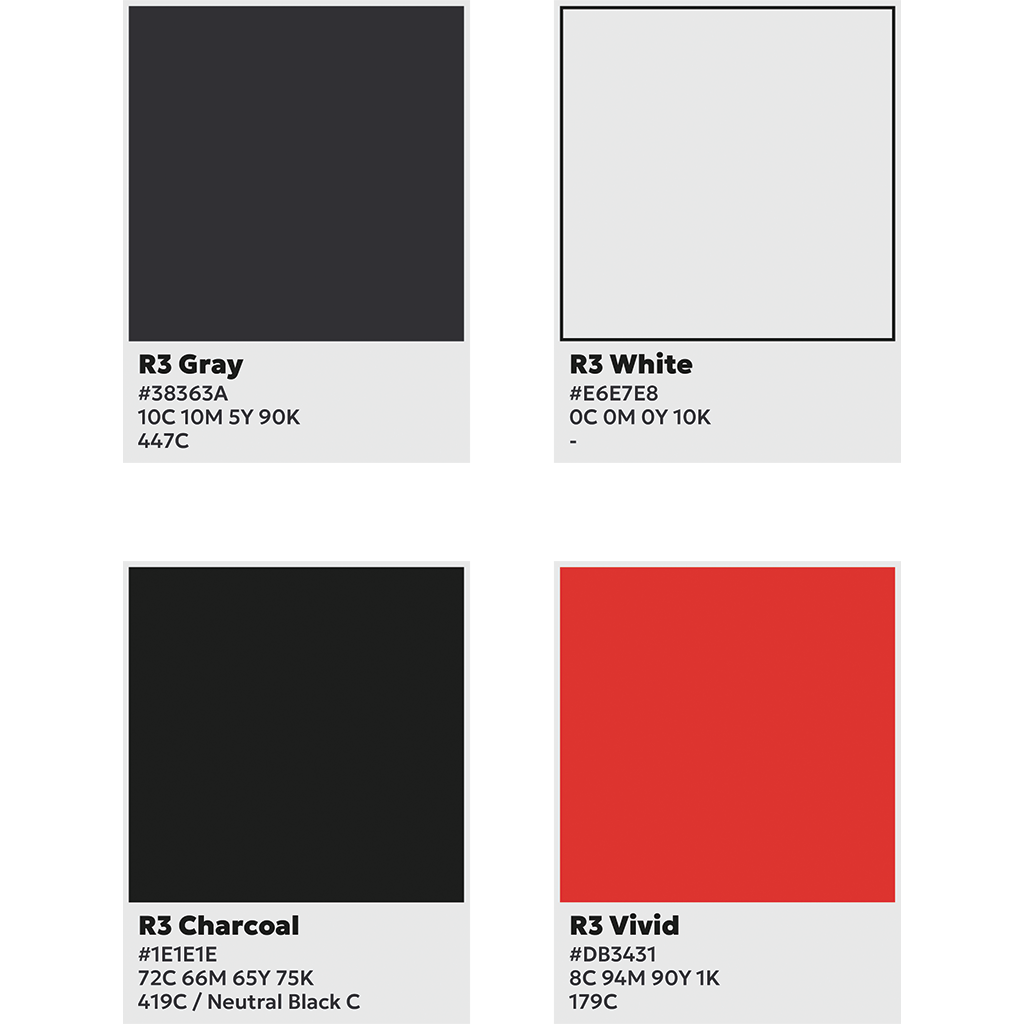
BRAND PALETTE
Round 3 Studios has four primary colors that define our brand identity.
These colors are the foundation of our visual language. The neutral tones—dark gray, light gray, and charcoal—represent stability and professionalism, while vivid red adds our passion, energy and emphasis.
Use these colors thoughtfully in type, backgrounds, and design elements, ensuring clarity and balance while allowing our content to take center stage.
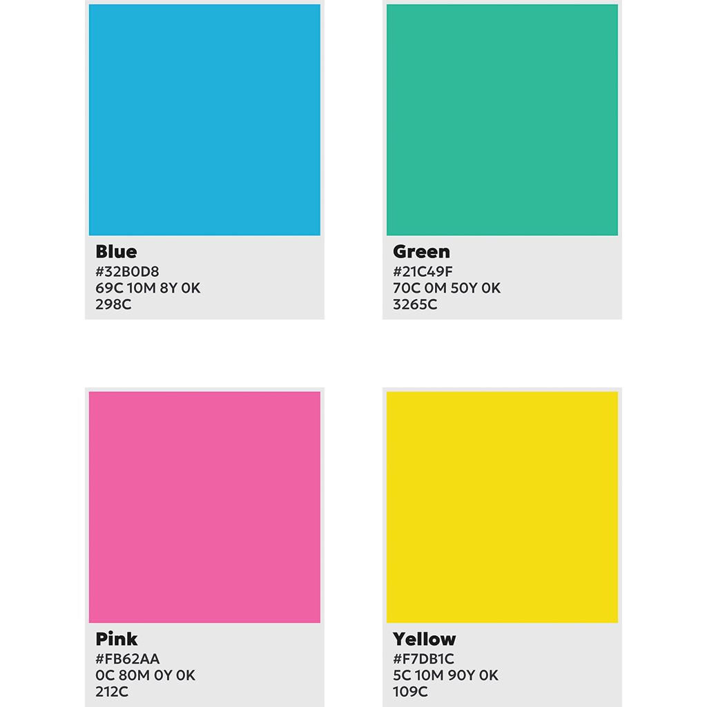
ACCENT COLORS
Our accent colors are designed to be vibrant and dynamic, reflecting the energy and creativity of our games. They should be used to emphasize key elements such as text, infographics, or UI components, bringing focus and clarity to important details.
While these colors are not tied to specific games, they harmonize with our primary palette and complement the overall visual identity of our brand. Accent colors should always enhance, not overshadow, the design, ensuring balance and cohesion across all applications.
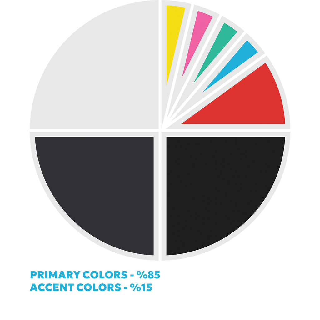
COLOR USAGE RATIO
The color usage ratio in our corporate touchpoints is represented visually through a circle chart, symbolizing balance and cohesion. Each segment of the circle reflects the proportionate use of our primary, accent, and supporting colors, ensuring they work harmoniously across all applications.
This ratio serves as a guide to help maintain consistency and visual clarity in our branding. The larger segments, often dedicated to neutral tones like grays, provide a strong foundation, while smaller portions highlight the vibrant accent colors that add energy and focus.
While the circle ratio offers a helpful framework, it is not a rigid rule. Flexibility is encouraged, allowing designs to adapt to context while staying true to the overall balance and aesthetic of our brand.
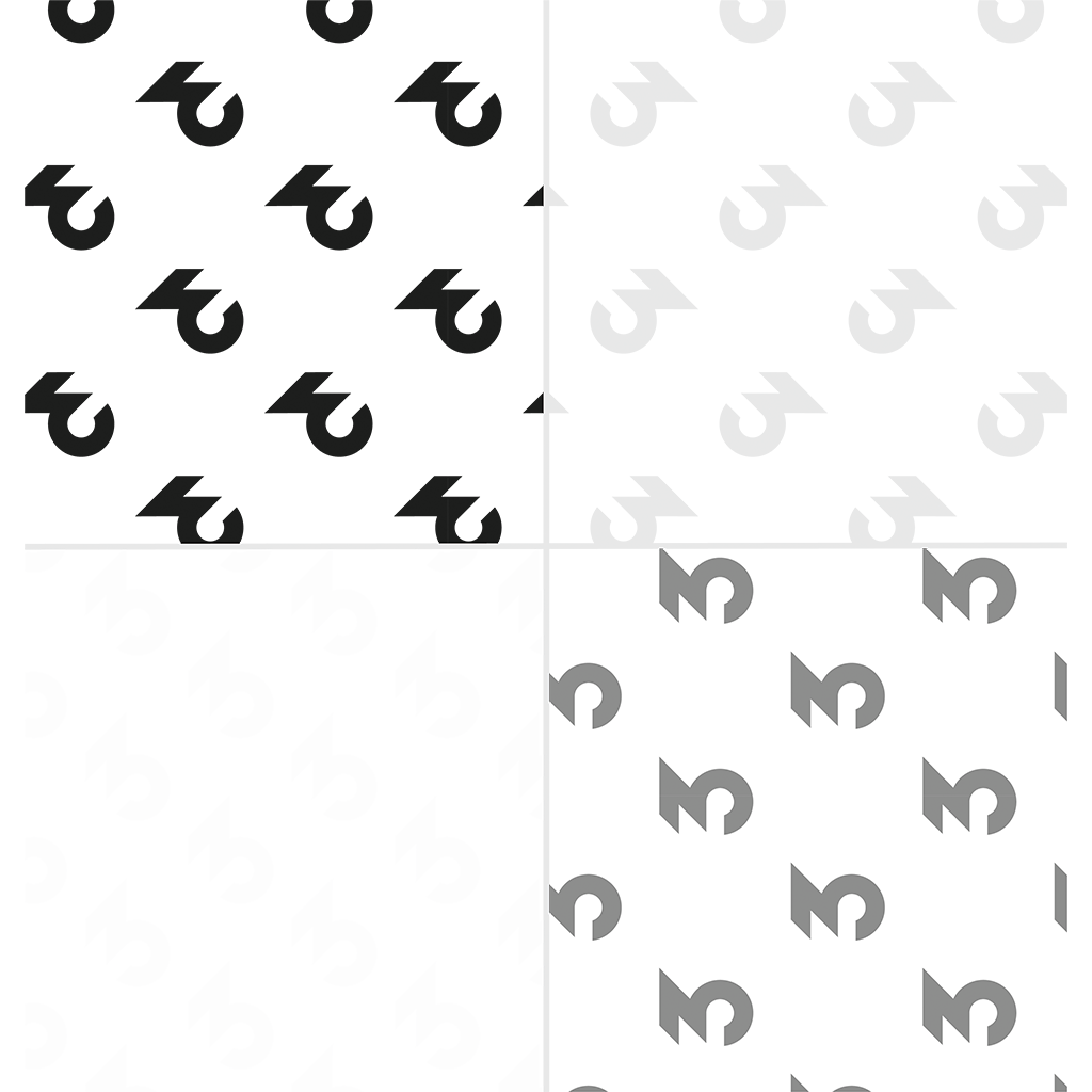
PATTERN USAGE
The stylistic "three" of Round 3 Studios is a versatile foundation for creating unique and varied patterns. Whether used subtly or boldly, these patterns can adapt to any design context while maintaining our brand identity.
Feel free to experiment and create different patterns using the "three" as a core element. Just ensure they remain clear and visually cohesive, allowing them to complement rather than compete with the overall design. Clarity and balance are key to making these patterns both functional and distinctive.